Matplotlib入门[05]——注释与标签
Matplotlib入门[05]——注释与标签
参考:
https://ailearning.apachecn.org/
Matplotlib官网
plt.legend参数
使用Jupyter进行练习

注释
使用文本框进行注释
import numpy.random
import matplotlib.pyplot as plt


fig = plt.figure(1, figsize=(5,5))
# plt.clf()清除整个当前graphics的所有坐标轴,但会将窗口打开,
# 以便可以重新用于其他graphics。
fig.clf()

ax = fig.add_subplot(111)
# y轴的单位刻度显示长度 与 x轴的单位刻度显示长度 的比例
ax.set_aspect(1)

x1 = -1 + numpy.random.randn(100)
y1 = -1 + numpy.random.randn(100)
x2 = 1. + numpy.random.randn(100)
y2 = 1. + numpy.random.randn(100)

# 散点图
ax.scatter(x1, y1, color="r")
ax.scatter(x2, y2, color="g")

# 加上两个文本框
bbox_props = dict(boxstyle="round", fc="w", ec="0.5", alpha=0.9)
ax.text(-2, -2, "Sample A", ha="center", va="center", size=20,
        bbox=bbox_props)
ax.text(2, 2, "Sample B", ha="center", va="center", size=20,
        bbox=bbox_props)

# 加上一个箭头文本框
bbox_props = dict(boxstyle="rarrow", fc=(0.8,0.9,0.9), ec="b", lw=2)
t = ax.text(0, 0, "Direction", ha="center", va="center", rotation=45,
            size=15,
            bbox=bbox_props)

bb = t.get_bbox_patch()
bb.set_boxstyle("rarrow", pad=0.6)

ax.set_xlim(-4, 4)
ax.set_ylim(-4, 4)

plt.show()
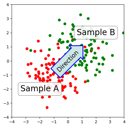
text() 函数接受 bbox 参数来绘制文本框。
bbox_props = dict(boxstyle="rarrow,pad=0.3", fc="cyan", ec="b", lw=2)
t = ax.text(0, 0, "Direction", ha="center", va="center", rotation=45,
            size=15,
            bbox=bbox_props)
可以这样来获取这个文本框,并对其参数进行修改:
bb = t.get_bbox_patch()
bb.set_boxstyle("rarrow", pad=0.6)
可用的文本框风格有:
| class | name | attrs |
|---|---|---|
| LArrow | larrow | pad=0.3 |
| RArrow | rarrow | pad=0.3 |
| Round | round | pad=0.3,rounding_size=None |
| Round4 | round4 | pad=0.3,rounding_size=None |
| Roundtooth | roundtooth | pad=0.3,tooth_size=None |
| Sawtooth | sawtooth | pad=0.3,tooth_size=None |
| Square | square | pad=0.3 |
import matplotlib.patches as mpatch
import matplotlib.pyplot as plt

styles = mpatch.BoxStyle.get_styles()

figheight = (len(styles)+.5)
fig1 = plt.figure(figsize=(4/1.5, figheight/1.5))
fontsize = 0.3 * 72
ax = fig1.add_subplot(111)

for i, (stylename, styleclass) in enumerate(styles.items()):
    ax.text(0.5, (float(len(styles)) - 0.5 - i)/figheight, stylename,
              ha="center",
              size=fontsize,
              transform=fig1.transFigure,
              bbox=dict(boxstyle=stylename, fc="w", ec="k"))

# 去掉轴的显示
ax.spines['right'].set_color('none')
ax.spines['top'].set_color('none')
ax.spines['left'].set_color('none')
ax.spines['bottom'].set_color('none')
plt.xticks([])
plt.yticks([])

plt.show()
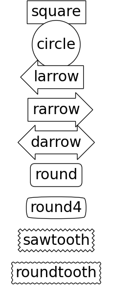
各个风格的文本框如上图所示。
使用箭头进行注释
plt.figure(1, figsize=(4,3))
ax = plt.subplot(111)

ax.annotate("",
            xy=(0.2, 0.2), xycoords='data',
            xytext=(0.8, 0.8), textcoords='data',
            arrowprops=dict(arrowstyle="->",
                            connectionstyle="arc3"),
            )

plt.show()
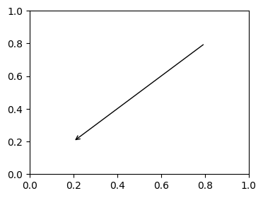
之前介绍了 annotate 中 xy, xycoords, xytext, textcoords 参数的含义,通常我们把 xy 设在 data 坐标系,把 xytext 设在 offset 即以注释点为原点的参考系。
箭头显示是可选的,用 arrowprops 参数来指定,接受一个字典作为参数。
不同类型的绘制箭头方式
import matplotlib.pyplot as plt
import matplotlib.patches as mpatches

x1, y1 = 0.3, 0.3
x2, y2 = 0.7, 0.7

fig = plt.figure(1, figsize=(8,3))
fig.clf()
from mpl_toolkits.axes_grid.axes_grid import AxesGrid
from mpl_toolkits.axes_grid.anchored_artists import AnchoredText

#from matplotlib.font_manager import FontProperties

def add_at(ax, t, loc=2):
    fp = dict(size=10)
    _at = AnchoredText(t, loc=loc, prop=fp)
    ax.add_artist(_at)
    return _at

grid = AxesGrid(fig, 111, (1, 4), label_mode="1", share_all=True)

grid[0].set_autoscale_on(False)

ax = grid[0]
ax.plot([x1, x2], [y1, y2], ".")
el = mpatches.Ellipse((x1, y1), 0.3, 0.4, angle=30, alpha=0.2)
ax.add_artist(el)
ax.annotate("",
            xy=(x1, y1), xycoords='data',
            xytext=(x2, y2), textcoords='data',
            arrowprops=dict(arrowstyle="-", #linestyle="dashed",
                            color="0.5",
                            patchB=None,
                            shrinkB=0,
                            connectionstyle="arc3,rad=0.3",
                            ),
            )

add_at(ax, "connect", loc=2)

ax = grid[1]
ax.plot([x1, x2], [y1, y2], ".")
el = mpatches.Ellipse((x1, y1), 0.3, 0.4, angle=30, alpha=0.2)
ax.add_artist(el)
ax.annotate("",
            xy=(x1, y1), xycoords='data',
            xytext=(x2, y2), textcoords='data',
            arrowprops=dict(arrowstyle="-", #linestyle="dashed",
                            color="0.5",
                            patchB=el,
                            shrinkB=0,
                            connectionstyle="arc3,rad=0.3",
                            ),
            )

add_at(ax, "clip", loc=2)

ax = grid[2]
ax.plot([x1, x2], [y1, y2], ".")
el = mpatches.Ellipse((x1, y1), 0.3, 0.4, angle=30, alpha=0.2)
ax.add_artist(el)
ax.annotate("",
            xy=(x1, y1), xycoords='data',
            xytext=(x2, y2), textcoords='data',
            arrowprops=dict(arrowstyle="-", #linestyle="dashed",
                            color="0.5",
                            patchB=el,
                            shrinkB=5,
                            connectionstyle="arc3,rad=0.3",
                            ),
            )

add_at(ax, "shrink", loc=2)

ax = grid[3]
ax.plot([x1, x2], [y1, y2], ".")
el = mpatches.Ellipse((x1, y1), 0.3, 0.4, angle=30, alpha=0.2)
ax.add_artist(el)
ax.annotate("",
            xy=(x1, y1), xycoords='data',
            xytext=(x2, y2), textcoords='data',
            arrowprops=dict(arrowstyle="fancy", #linestyle="dashed",
                            color="0.5",
                            patchB=el,
                            shrinkB=5,
                            connectionstyle="arc3,rad=0.3",
                            ),
            )

add_at(ax, "mutate", loc=2)

grid[0].set_xlim(0, 1)
grid[0].set_ylim(0, 1)
grid[0].axis["bottom"].toggle(ticklabels=False)
grid[0].axis["left"].toggle(ticklabels=False)
fig.subplots_adjust(left=0.05, right=0.95, bottom=0.05, top=0.95)

plt.draw()
plt.show()
C:\Users\26969\AppData\Local\Temp\ipykernel_2156\2823481789.py:9: MatplotlibDeprecationWarning:
The mpl_toolkits.axes_grid module was deprecated in Matplotlib 2.1 and will be removed two minor releases later. Use mpl_toolkits.axes_grid1 and mpl_toolkits.axisartist, which provide the same functionality instead.
  from mpl_toolkits.axes_grid.axes_grid import AxesGrid
字典中,connectionstyle 参数控制路径的风格:
| Name | Attr |
|---|---|
| angle | angleA=90,angleB=0,rad=0.0 |
| angle3 | angleA=90,angleB=0 |
| arc | angleA=0,angleB=0,armA=None,armB=None,rad=0.0 |
| arc3 | rad=0.0 |
| bar | armA=0.0,armB=0.0,fraction=0.3,angle=None |
import matplotlib.pyplot as plt
import matplotlib.patches as mpatches

fig = plt.figure(1, figsize=(8,5))
fig.clf()
from mpl_toolkits.axes_grid.axes_grid import AxesGrid
from mpl_toolkits.axes_grid.anchored_artists import AnchoredText

#from matplotlib.font_manager import FontProperties

def add_at(ax, t, loc=2):
    fp = dict(size=8)
    _at = AnchoredText(t, loc=loc, prop=fp)
    ax.add_artist(_at)
    return _at

grid = AxesGrid(fig, 111, (3, 5), label_mode="1", share_all=True)

grid[0].set_autoscale_on(False)

x1, y1 = 0.3, 0.3
x2, y2 = 0.7, 0.7

def demo_con_style(ax, connectionstyle, label=None):

    if label is None:
        label = connectionstyle

    x1, y1 = 0.3, 0.2
    x2, y2 = 0.8, 0.6

    ax.plot([x1, x2], [y1, y2], ".")
    ax.annotate("",
                xy=(x1, y1), xycoords='data',
                xytext=(x2, y2), textcoords='data',
                arrowprops=dict(arrowstyle="->", #linestyle="dashed",
                                color="0.5",
                                shrinkA=5, shrinkB=5,
                                patchA=None,
                                patchB=None,
                                connectionstyle=connectionstyle,
                                ),
                )

    add_at(ax, label, loc=2)

column = grid.axes_column[0]

demo_con_style(column[0], "angle3,angleA=90,angleB=0",
               label="angle3,\nangleA=90,\nangleB=0")
demo_con_style(column[1], "angle3,angleA=0,angleB=90",
               label="angle3,\nangleA=0,\nangleB=90")

column = grid.axes_column[1]

demo_con_style(column[0], "arc3,rad=0.")
demo_con_style(column[1], "arc3,rad=0.3")
demo_con_style(column[2], "arc3,rad=-0.3")

column = grid.axes_column[2]

demo_con_style(column[0], "angle,angleA=-90,angleB=180,rad=0",
               label="angle,\nangleA=-90,\nangleB=180,\nrad=0")
demo_con_style(column[1], "angle,angleA=-90,angleB=180,rad=5",
               label="angle,\nangleA=-90,\nangleB=180,\nrad=5")
demo_con_style(column[2], "angle,angleA=-90,angleB=10,rad=5",
               label="angle,\nangleA=-90,\nangleB=10,\nrad=0")

column = grid.axes_column[3]

demo_con_style(column[0], "arc,angleA=-90,angleB=0,armA=30,armB=30,rad=0",
               label="arc,\nangleA=-90,\nangleB=0,\narmA=30,\narmB=30,\nrad=0")
demo_con_style(column[1], "arc,angleA=-90,angleB=0,armA=30,armB=30,rad=5",
               label="arc,\nangleA=-90,\nangleB=0,\narmA=30,\narmB=30,\nrad=5")
demo_con_style(column[2], "arc,angleA=-90,angleB=0,armA=0,armB=40,rad=0",
               label="arc,\nangleA=-90,\nangleB=0,\narmA=0,\narmB=40,\nrad=0")

column = grid.axes_column[4]

demo_con_style(column[0], "bar,fraction=0.3",
               label="bar,\nfraction=0.3")
demo_con_style(column[1], "bar,fraction=-0.3",
               label="bar,\nfraction=-0.3")
demo_con_style(column[2], "bar,angle=180,fraction=-0.2",
               label="bar,\nangle=180,\nfraction=-0.2")

#demo_con_style(column[1], "arc3,rad=0.3")
#demo_con_style(column[2], "arc3,rad=-0.3")

grid[0].set_xlim(0, 1)
grid[0].set_ylim(0, 1)
grid.axes_llc.axis["bottom"].toggle(ticklabels=False)
grid.axes_llc.axis["left"].toggle(ticklabels=False)
fig.subplots_adjust(left=0.05, right=0.95, bottom=0.05, top=0.95)

plt.draw()
plt.show()
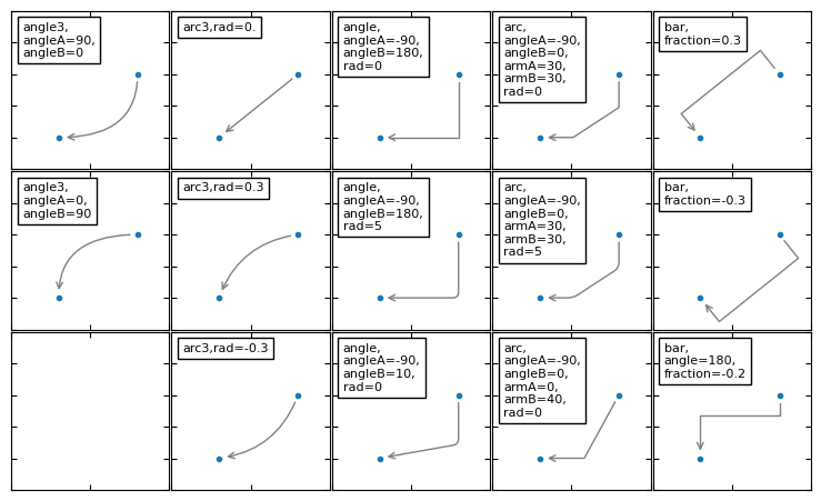
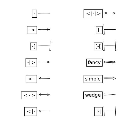
arrowstyle 参数控制小箭头的风格:
| Name | Attrs |
|---|---|
- | None |
-> | head_length=0.4,head_width=0.2 |
-[ | widthB=1.0,lengthB=0.2,angleB=None |
¦-¦ | widthA=1.0,widthB=1.0 |
-¦> | head_length=0.4,head_width=0.2 |
<- | head_length=0.4,head_width=0.2 |
<-> | head_length=0.4,head_width=0.2 |
<¦- | head_length=0.4,head_width=0.2 |
<¦-¦> | head_length=0.4,head_width=0.2 |
fancy | head_length=0.4,head_width=0.4,tail_width=0.4 |
simple | head_length=0.5,head_width=0.5,tail_width=0.2 |
wedge | tail_width=0.3,shrink_factor=0.5 |
import matplotlib.patches as mpatches
import matplotlib.pyplot as plt

styles = mpatches.ArrowStyle.get_styles()

ncol=2
nrow = (len(styles)+1) // ncol
figheight = (nrow+0.5)
fig1 = plt.figure(1, (4.*ncol/1.5, figheight/1.5))
fontsize = 0.2 * 70

ax = fig1.add_axes([0, 0, 1, 1], frameon=False, aspect=1.)

ax.set_xlim(0, 4*ncol)
ax.set_ylim(0, figheight)

def to_texstring(s):
    s = s.replace("<", r"$<$")
    s = s.replace(">", r"$>$")
    s = s.replace("|", r"$|$")
    return s

for i, (stylename, styleclass) in enumerate(sorted(styles.items())):
    x = 3.2 + (i//nrow)*4
    y = (figheight - 0.7 - i%nrow) # /figheight
    p = mpatches.Circle((x, y), 0.2, fc="w")
    ax.add_patch(p)

    ax.annotate(to_texstring(stylename), (x, y),
                (x-1.2, y),
                #xycoords="figure fraction", textcoords="figure fraction",
                ha="right", va="center",
                size=fontsize,
                arrowprops=dict(arrowstyle=stylename,
                                patchB=p,
                                shrinkA=5,
                                shrinkB=5,
                                fc="w", ec="k",
                                connectionstyle="arc3,rad=-0.05",
                                ),
                bbox=dict(boxstyle="square", fc="w"))

ax.xaxis.set_visible(False)
ax.yaxis.set_visible(False)

plt.draw()
plt.show()
标签
import numpy as np
import matplotlib as mpl
import matplotlib.pyplot as plt
legend() 函数被用来添加图像的标签,其主要相关的属性有:
- legend entry - 一个 legend 包含一个或多个 entry,一个 entry 对应一个 key 和一个 label
- legend key - marker 的标记
- legend label - key 的说明
- legend handle - 一个 entry 在图上对应的对象
使用legend
参数:
-
loc: 显示位置,若是使用了bbox_to_anchor,则这项就无效了- ‘best’ : 0, (only implemented for axes legends)(自适应方式)
- ‘upper right’ : 1,
- ‘upper left’ : 2,
- ‘lower left’ : 3,
- ‘lower right’ : 4,
- ‘right’ : 5,
- ‘center left’ : 6,
- ‘center right’ : 7,
- ‘lower center’ : 8,
- ‘upper center’ : 9,
- ‘center’ : 10
-
fontsize: 字体大小, -
frameon: 是否显示图例边框, -
ncol: 图例的列的数量,一般为1, -
title: 为图例添加标题 -
shadow: 为图例边框添加阴影, -
markerfirst: True表示图例标签在句柄右侧,false反之, -
markerscale: 图例标记为原图标记中的多少倍大小, -
numpoints: 表示图例中的句柄上的标记点的个数,一般设为1, -
fancybox: 是否将图例框的边角设为圆形 -
framealpha: 控制图例框的透明度 -
borderpad: 图例框内边距 -
labelspacing: 图例中条目之间的距离 -
handlelength: 图例句柄的长度 -
bbox_to_anchor: (横向看右,纵向看下),如果要自定义图例位置或者将图例画在坐标外边,用它。
调用 legend() 会自动获取当前的 Axes 对象,并且得到这些 handles 和 labels,相当于:
handles, labels = ax.get_legend_handles_labels()
ax.legend(handles, labels)
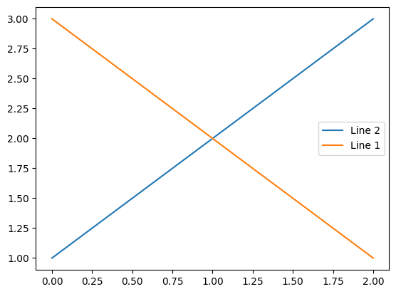
可以在函数中指定 handles 的参数:
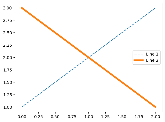
line_up, = plt.plot([1,2,3], label='Line 2')
line_down, = plt.plot([3,2,1], label='Line 1')
plt.legend(handles=[line_up, line_down])
plt.show()
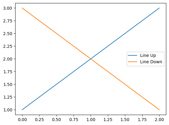
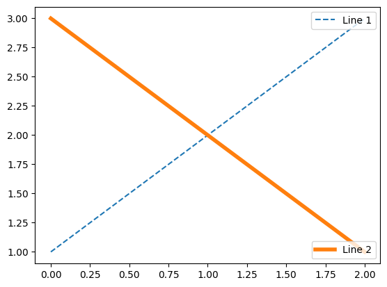
可以将 labels 作为参数输入 legend 函数:
line_up, = plt.plot([1,2,3])
line_down, = plt.plot([3,2,1])
plt.legend([line_up, line_down], ['Line Up', 'Line Down'])
plt.show()
特殊形状的maker key
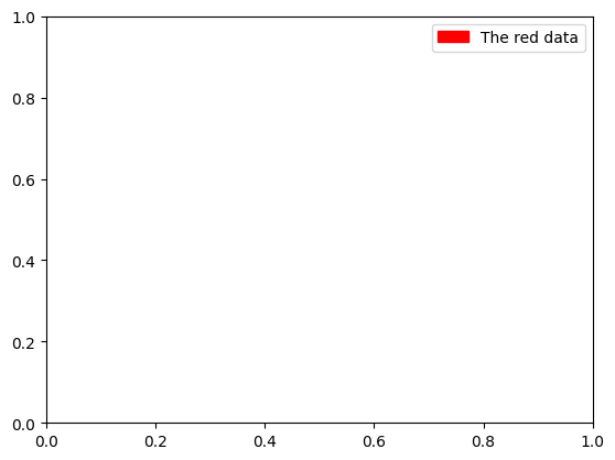
块状
# 拥有一些比较常用的形状:箭头、正方形、椭圆等
import matplotlib.patches as mpatches

red_patch = mpatches.Patch(color='red', label='The red data')
plt.legend(handles=[red_patch])

plt.show()
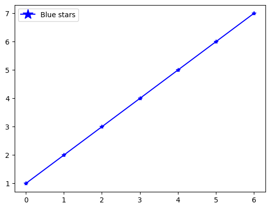
点线组合
import matplotlib.lines as mlines
import matplotlib.pyplot as plt

blue_line = mlines.Line2D([1,2,3], [1,2,3], color='blue', marker='*',
                          markersize=15, label='Blue stars')
plt.plot([1,2,3,4,5,6,7],'b*-')
plt.legend(handles=[blue_line])

plt.show()
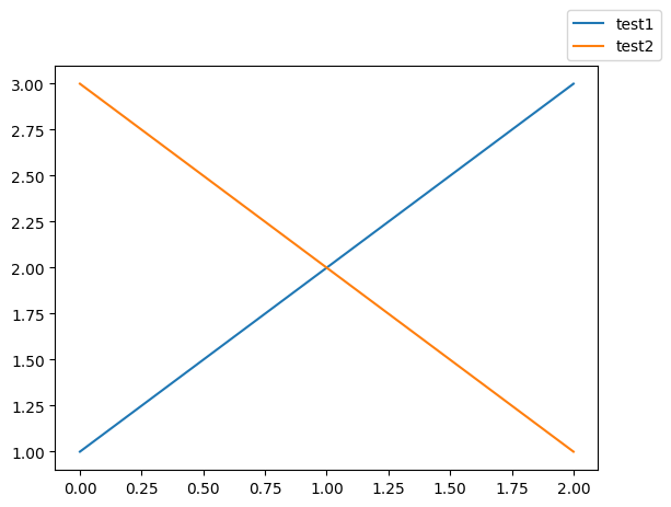
指定legend的位置
bbox_to_anchor 关键词可以指定 legend 放置的位置,例如放到图像的右上角:
plt.plot([1,2,3], label="test1")
plt.plot([3,2,1], label="test2")
plt.legend(bbox_to_anchor=(1, 1),
           bbox_transform=plt.gcf().transFigure)

plt.show()
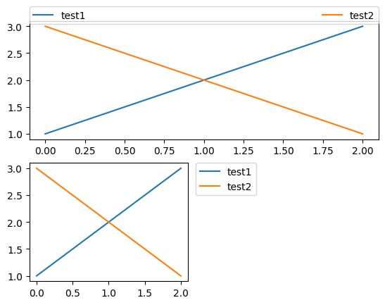
plt.subplot(211)
plt.plot([1,2,3], label="test1")
plt.plot([3,2,1], label="test2")
# 将标签放在图像上方,并进行延长
plt.legend(bbox_to_anchor=(0., 1.02, 1., .102),
           ncol=2, mode="expand", borderaxespad=0.)

plt.subplot(223)
plt.plot([1,2,3], label="test1")
plt.plot([3,2,1], label="test2")
# 将标签放在小图形的右方
plt.legend(bbox_to_anchor=(1.05, 1), loc=2, borderaxespad=0.)

plt.show()
同一个 Axes 中的多个 legend
原始效果:
line1, = plt.plot([1,2,3], label="Line 1", linestyle='--')
line2, = plt.plot([3,2,1], label="Line 2", linewidth=4)
plt.legend()
plt.show()
添加多个legend:
line1, = plt.plot([1,2,3], label="Line 1", linestyle='--')
line2, = plt.plot([3,2,1], label="Line 2", linewidth=4)
# 为第一条线添加legend
first_legend = plt.legend(handles=[line1], loc=1)

# 将legend手动添加到当前的Axes.
ax = plt.gca().add_artist(first_legend)

# 为第二条线添加legend
plt.legend(handles=[line2], loc=4)

plt.show()
更多用法
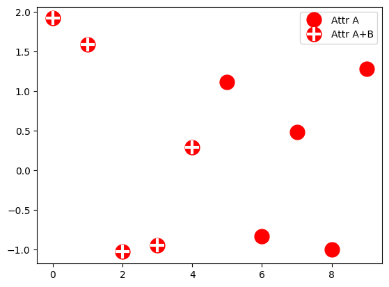
多个handle可以通过括号组合在一个entry里。
from numpy.random import randn

z = randn(10)

red_dot, = plt.plot(z, "ro", markersize=15)
# 给数据加上白色十字.
white_cross, = plt.plot(z[:5], "w+", markeredgewidth=3, markersize=15)

plt.legend([red_dot, (red_dot, white_cross)], ["Attr A", "Attr A+B"])

plt.show()
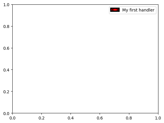
自定义handle:
import matplotlib.pyplot as plt
import matplotlib.patches as mpatches

class AnyObject(object):
    pass

class AnyObjectHandler(object):
    def legend_artist(self, legend, orig_handle, fontsize, handlebox):
        x0, y0 = handlebox.xdescent, handlebox.ydescent
        width, height = handlebox.width, handlebox.height
        patch = mpatches.Rectangle([x0, y0], width, height, facecolor='red',
                                   edgecolor='black', hatch='xx', lw=3,
                                   transform=handlebox.get_transform())
        handlebox.add_artist(patch)
        return patch

plt.legend([AnyObject()], ['My first handler'],
           handler_map={AnyObject: AnyObjectHandler()})

plt.show()
椭圆
from matplotlib.legend_handler import HandlerPatch
import matplotlib.pyplot as plt
import matplotlib.patches as mpatches

class HandlerEllipse(HandlerPatch):
    def create_artists(self, legend, orig_handle,
                       xdescent, ydescent, width, height, fontsize, trans):
        center = 0.5 * width - 0.5 * xdescent, 0.5 * height - 0.5 * ydescent
        p = mpatches.Ellipse(xy=center, width=width + xdescent,
                             height=height + ydescent)
        self.update_prop(p, orig_handle, legend)
        p.set_transform(trans)
        return [p]

c = mpatches.Circle((0.5, 0.5), 0.25, facecolor="green",
                    edgecolor="red", linewidth=3)
plt.gca().add_patch(c)

plt.legend([c], ["An ellipse, not a rectangle"],
           handler_map={mpatches.Circle: HandlerEllipse()})

plt.show()
![[外链图片转存失败,源站可能有防盗链机制,建议将图片保存下来直接上传(img-A3UUzJDp-1670378914310)(https://note-image-1307786938.cos.ap-beijing.myqcloud.com/typora/05%E6%B3%A8%E9%87%8A%E5%92%8C%E6%A0%87%E7%AD%BE_49_0.png)]](https://img-blog.csdnimg.cn/72b8144eed174762bc6d6d8cbf9a846b.png)